
Draft for review. The article content in this guide is migrated and unchanged. The introduction and the short lead-in paragraph at the top of each section are newly written and are marked “New text — pending review” — nothing in them has been approved yet.
Before picking a stock, read the market. These pages cover the Market tab’s big picture — indexes, breadth, the Economic Dashboard — and the heat-map view of where money is moving.
You can read straight through, or use the contents list to jump to what you need. Every section below is also a standalone article — the “Open as article” link under each one takes you to it on its own page, if you want to bookmark or share just that piece.
The market at a glance
New text — pending review
Indexes, advancers and decliners, highs and lows, the broad overview, and the Economic Dashboard’s report charts.
Market – The Big Picture
Start here for the overall outlook.
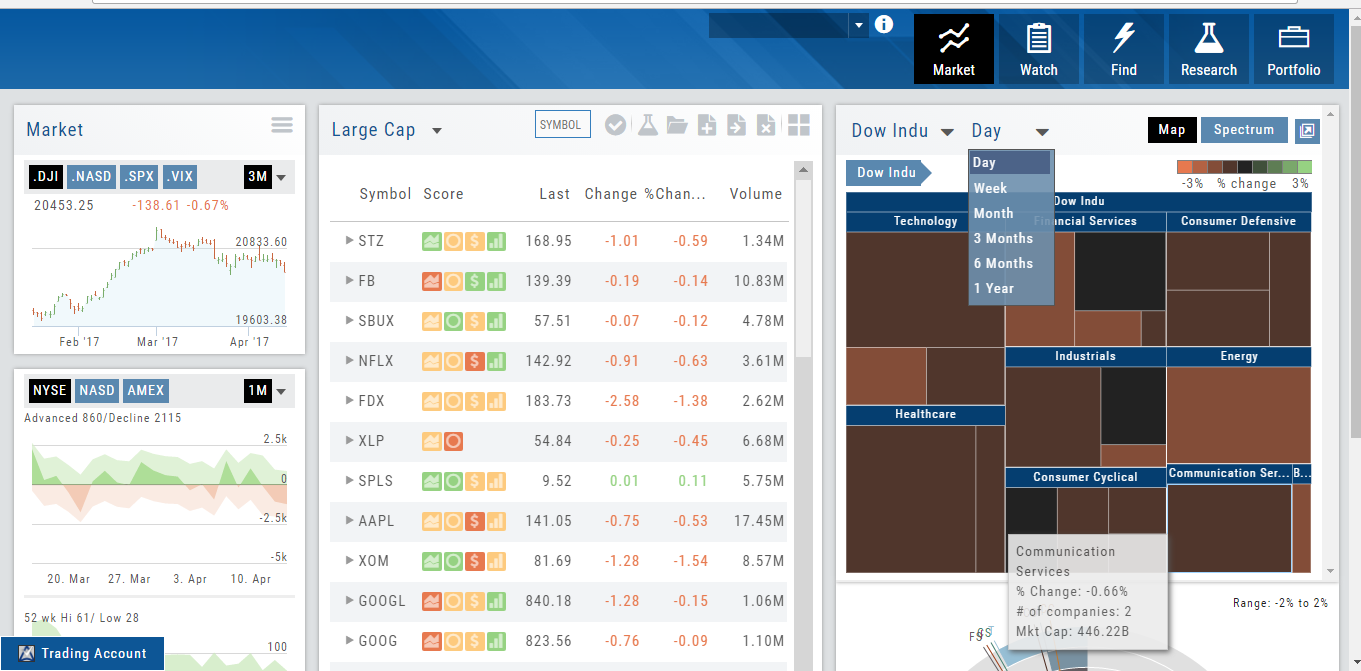
Designed to show what the overall markets are doing by viewing the graphs, charts and maps. You can change the time frame to check trends, use the maps on the right side of the page for a picture of sectors in relation to the market. Even drill down to industry within the sector and more.
Market – Index Overview
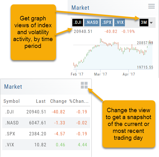
In the default Graph View, get a visual view of Market or Volatility Index activity by a 1-day or 1, 3 or 6 month time frame. By sliding your cursor along the graph, an activity box will display more in-depth activity: Every two minutes for the 1-Day Graph, or Daily for the 1, 3 or 6 month graph.
The current market activity/most recent trading day, regardless of time-frame, is present on the default view under the Index box selections – or by selecting the List View to get: Current, point change and percentage change (green = positive, red = negative).
Market Overview: Get more of a broad view
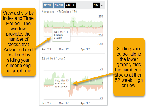
View activity of the NYSE, Nasdaq or American Stock Exchange by time frame. The upper area of this part of the Market Tab shows the number of advancing or declining stocks by sliding your cursor along the graph.
Likewise, the bottom portion of shows the number of stocks that reached their 52-week High or Low by sliding your cursor along the lower graph.
The constant figures show the number of stocks in each category for the current/most recent trading day.
Advanced/Declined & Highs/Lows
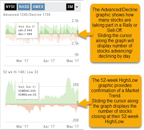
The Graphs on the left side of the Market page can provide confirmation of whether there was a Rally or Sell-Off in the time frame selected by providing the numbers of stocks taking part in of the movement.
The 52-week High/Low Graph further confirms if there is a Market Trend by showing how many stocks closed at their 52-week High/Low.
Note, you can select a 1, 3 or 6 Month or 1 Year time frame in which to view the data. By sliding the cursor along the horizontal ‘0’ (zero) line on each graph, data for each day will appear.
Economic Dashboard
Located under the Home/Market Tab, this powerful research tool provides important economic information in chart format. 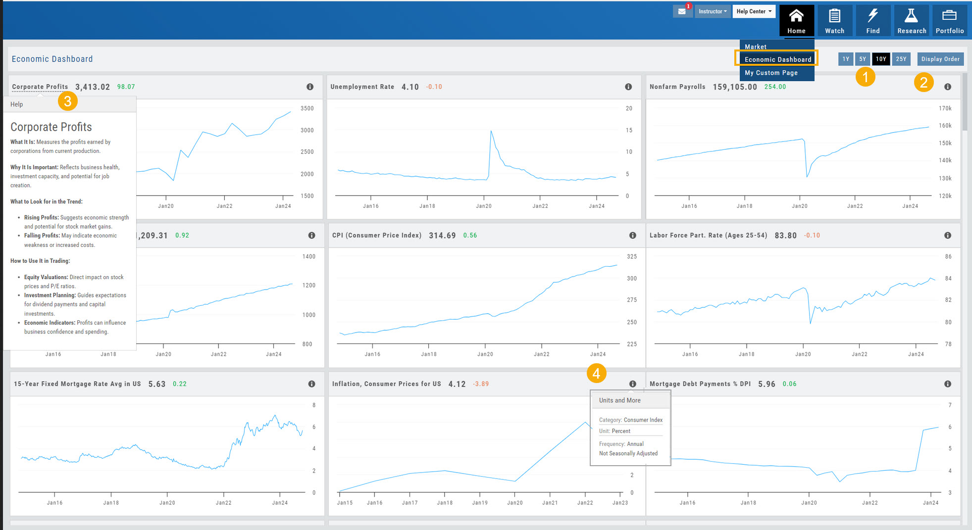
- Select from 1*, 5,10 or 25-year views
- Allows you to select display order as well as ‘hide’ charts.
- Click on the Title to display: What the data represents, Why it is important, What to look for and How to apply the data in trading
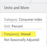
- Provides info on the Economic Report Category (Consumer), what the numbers represent (%, $, units, etc), how Frequent the data is reported (Quarterly, Annually, Monthly, etc)
* Some reports are released annually. 5, 10 or 25 year view are recommended in these instances.
Heat maps
New text — pending review
The market drawn as a map — and where to go for the full heat-map toolkit.
Heat Map & Spectrum Overview
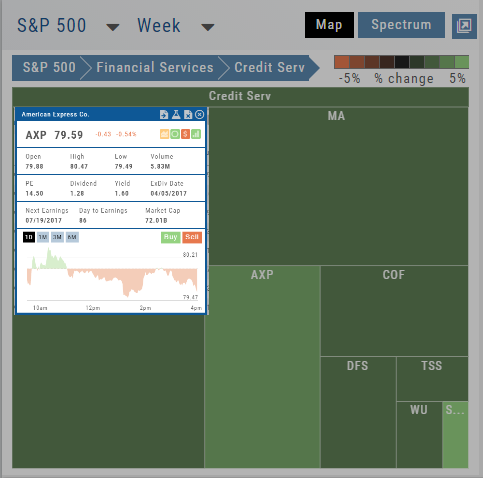 Financial Services > Credit Serv on the Week view, with the American Express quote popup open: price, Open/High/Low/Volume, PE, Dividend, Yield, ExDiv Date, Next Earnings, Market Cap, and a 1-Day chart with Buy/Sell buttons” class=”wp-image-573″ width=”360″ height=”356″ style=”width:360px;height:auto”/>
For Example: Clicking on “Financial Services” industry portion on the map of the S&P 500, then “Credit Services” will yield another map of 8 companies: Visa, Mastercard, American Express, etc. Clicking on any of those boxes will display the Stock info at a glance. Notice the Navigation Icons such as The Score as well as those to add to a Watchlist or send to Research.
The “Spectrum” View maps the sectors within the Index, with the number of companies in (parenthesis) by the performance by the time-frame selected. You can drill-down by selecting the sector group, then industry and company.
Note: By selecting the “Go Big” Icon,  , in the upper-right corner of the panel, expands the amount of information and navigational icons.