Charting runs from the basics — chart types, navigation, saved profiles — through indicators and drawing tools, to trading straight from the chart and reading the market through heat maps. This guide follows that same path.
You can read straight through, or use the contents list to jump to what you need. Every section below is also a standalone article — the “Open as article” link under each one takes you to it on its own page, if you want to bookmark or share just that piece.
Chart basics
Chart Types
Lines, Bars, Candles & Comparisons
You have the flexibility in not only the way the data is displayed, but you also have choices in comparisons: Year-over-Year comparisons of your current Stock, up to a 5-year period. You can also compare your current stock to another stock, another index, ETF, etc.
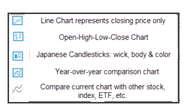
Chart Navigation
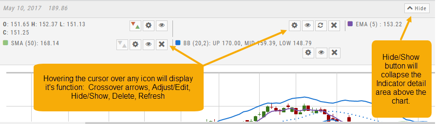
Hovering the cursor over the icons will display its function.
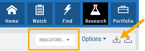
In the upper right of the Chart screen, you can select which Chart Profile to research from the drop-down box, then save or delete the profile.

The next set of icons immediately below this gives more charting capabilities: Increase/Decrease price ranges, Reset price range, Hide/Show Navigation Bar, Move the date Back/Forward, Export/Print Chart

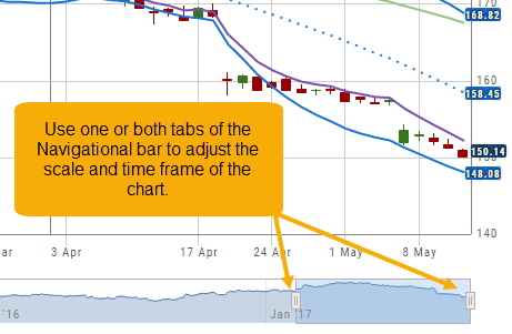
Other features include the Navigation Bar (below the chart). The shaded area corresponds to the chart time period. Slide one or both tabs of the bar to adjust the time period covered.
The “Hide/Show” button near the top-right of the screen will collapse the Indicator Detail area above the chart.
Adjust Chart Height & Width
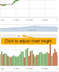
The height of the chart can be adjusted by clicking and dragging the tab under the main chart.
This is a feature unique per device. You can have separate settings for your laptop/desktop, notebook or even tablet.
To widen the chart, click the blue tab on the left side of the chart. This will collapse the Quote Bar to the left of the chart. You can ‘undo’ this by clicking the tab again.
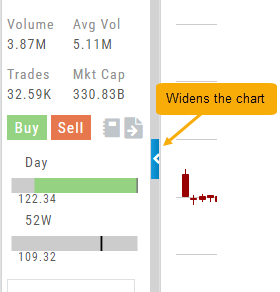
Chart Adjustment/y-axis
Chart Adjustment
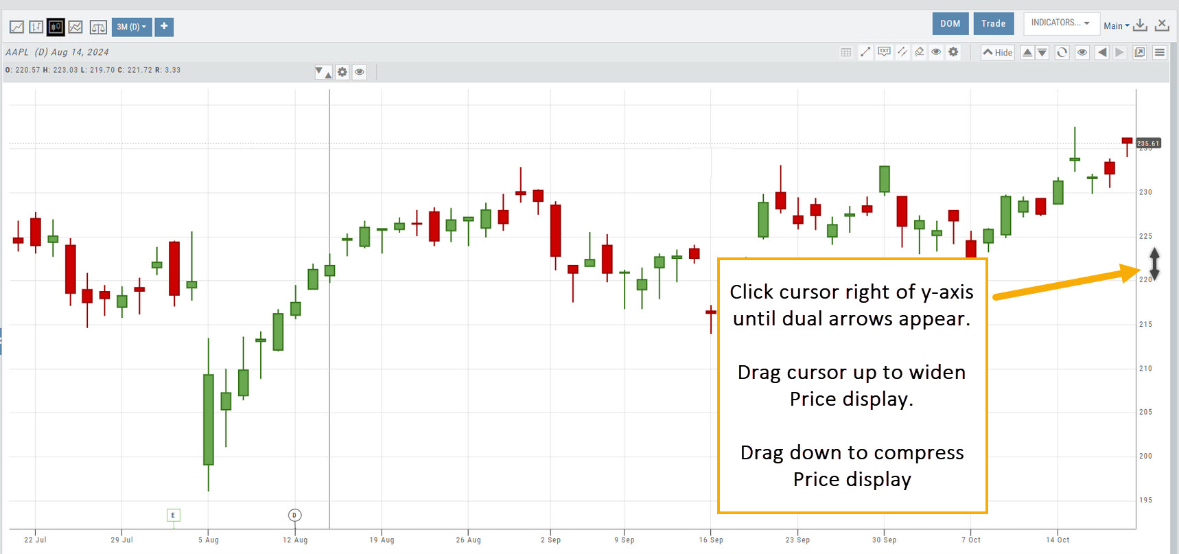
Adjusting the chart’s y-axis gives you more flexibility – whether it’s forecasting, adding notes, viewing current positions, etc.
Simply click your cursor to the right of the y-axis, then drag your mouse/cursor up or down.
To reset, click the ‘refresh’ icon  on the chart toolbar
Zoom Feature
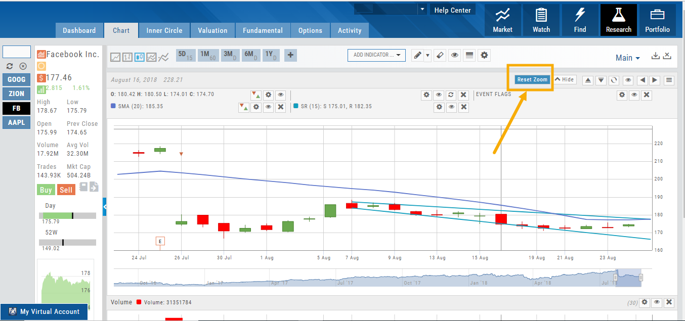
Activate the Zoom Feature on the Chart by clicking on the Icon as shown:
The icon will darken when activated – or, depending on your theme, may show up brighter: 
You can then “Click/Drag” your cursor.
A “Reset Zoom” button will automatically appear on the new display. When you are finished with your studies, simply click the same icon to restore the original time-period setting.
Add/Delete/Save Chart Profiles
Create multiple chart profiles for your analysis. Saved profiles will remember your settings: chart type, time frame including “Extend By 10,30,60 or 90 Days”, indicators, etc.
After you’ve set up your chart:
1. Click the ‘Save’ Icon
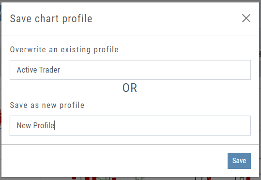
2. You’ll be prompted to Overwrite an existing profile or Save as a new profile**
3. Click ‘Save’ – (the box will disappear after a second or two)
That’s it!
You can remove unwanted profiles by clicking the [x] icon to delete, located next to the ‘Save’ icon.
**Note: Active Trader, Options, and Standard View are System views and cannot be altered or deleted. You will be prompted to save the new settings or overwrite a different view.
Chart Period Controls
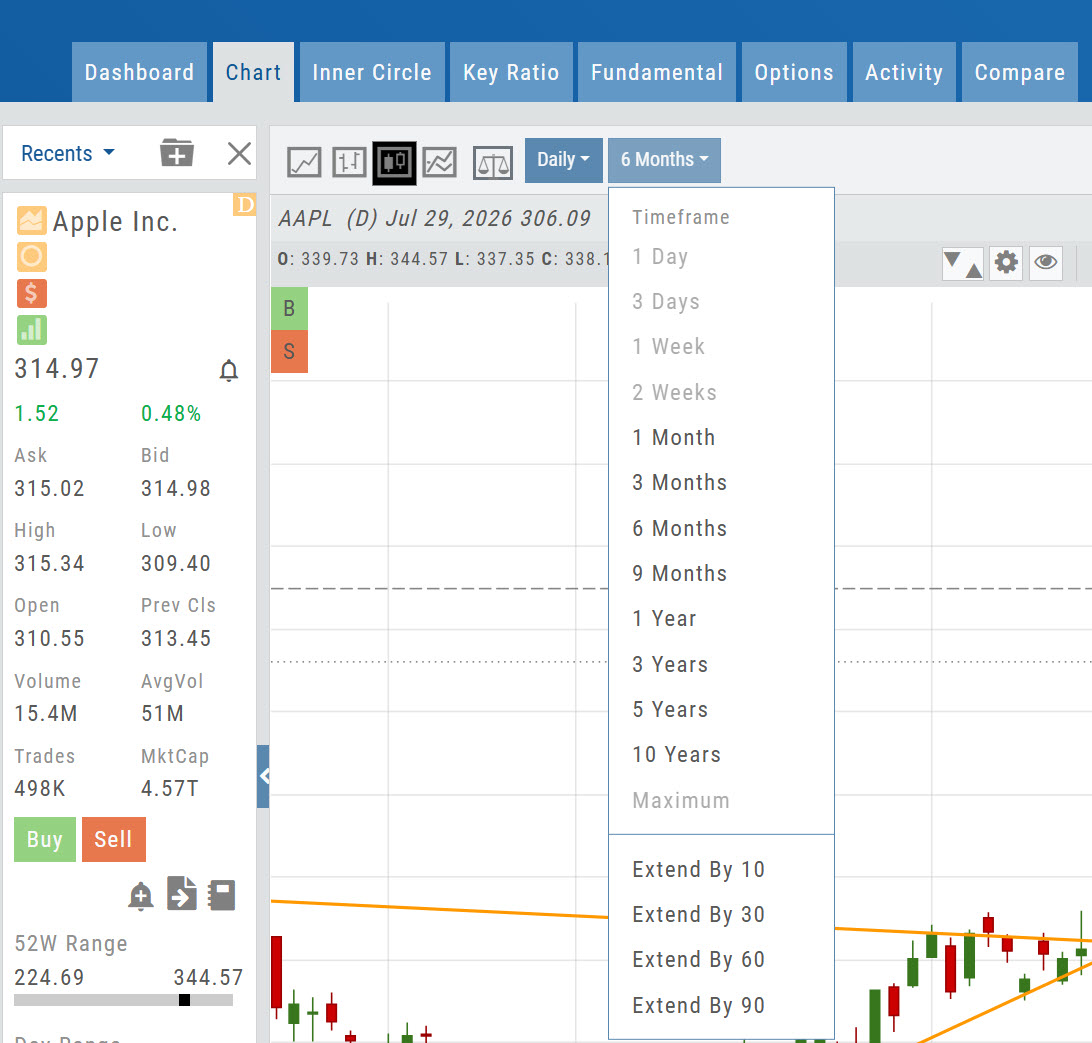
Chart Interval and Timeframe selections are made independently, giving you more flexibility when setting up your charts.
- Interval determines how each chart bar or candle is displayed — such as Daily, Weekly, 1 Minute, 5 Minutes, etc.
- Timeframe determines how much historical data is displayed — such as 1 Day, 1 Month, 6 Months, 1 Year, and more.
- Your selections are sticky, meaning they remain in place until you change them.
- Extend By 10, 30, 60, or 90 is now available within the Timeframe menu.
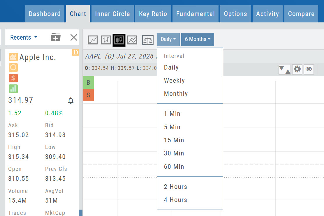
The Interval and Timeframe menus work together. Compatible selections are shown normally, while unavailable combinations are faded.
Example: Selecting a 1 Minute Interval allows Timeframes of 1 Day, 3 Days, or 1 Week.
Helpful Hint: Save your favorite Interval and Timeframe combinations as Chart Profiles for quick access. You can overwrite an existing profile or save the settings as a new profile — for example, “Weekly 1 Year.”
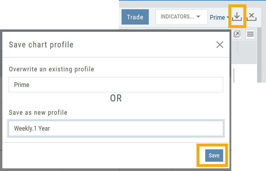
Chart Adjusts for Splits
When a stock has a Split history,  will appear next to the Indicator Box above the chart.
Make sure the chart period selected covers when the split occurred. This is identified on the x-axis of the chart as  .
.
When the “UnAdj” button is clicked, the chart will display ‘before’ & ‘after’ split pricing.
Click the “UnAdj” button again to restore the prior chart display.
Indicators
Adding & Arranging Indicators
Select  to add to your studies.
Indicators are grouped by Upper Indicators (which will appear on the Chart) and Lower Indicators (listed below the chart)
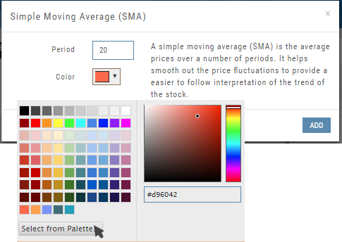
Once selected, you can customize the parameters – including the type of line you want for Moving Averages.
The upper Indicator selection summary appears above the chart and has an associated toolbar that allows edits (gear) hide/display(eye), refresh, or remove.. 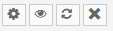
Lower indicators can be displayed/hidden, move placement up/down, or delete it to truly customize your view. 
Make sure to Save Your New Chart Settings 
Note: You cannot alter System Views: Active Trader, Options or Standard View. You will be prompted to either Overwrite or Save as a New Profile another available profile, such as Default or another Personal View.
Customizing Indicators
Customize Indicator Settings – even in different Chart Profiles!
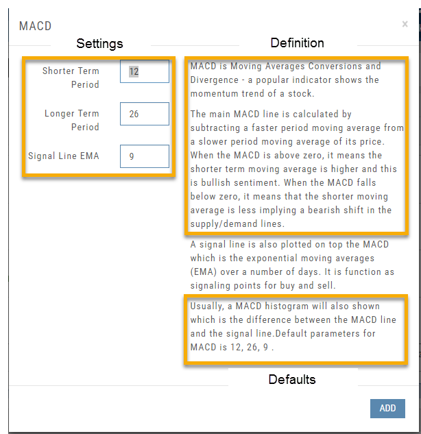
Customize the settings by clicking on the “Add Indicator” box at the top, center of the screen. Scroll to the Indicator you wish to add/edit. Left-click on the selection for a customization box to appear.
The Indicator window shows which settings can be changed.
Bonus! You can save different settings for the same indicator in different chart profiles. No need to change settings from one profile to the next.
In addition to the settings, this feature also provides a description of the indicator and the default settings.
Lower Indicators
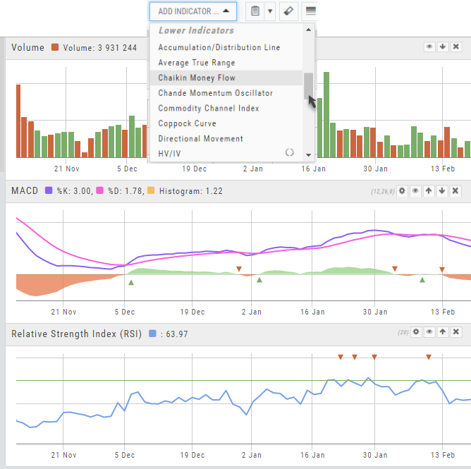
The “Add Indicator” drop-down box has a section of Lower Indicators you can add below the main chart.
Many of the Indicators allow you to customize the parameters prior to adding.
Once the Indicators are in place, the icon tool bar – found on the upper right above each graph- gives you the ability to edit (Gear), hide (Eye), move up/down (Arrows) or delete (X) to truly customize your view.

Advanced Indicators
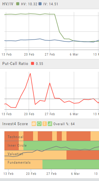
We offer select Advanced Upper and Lower Indicators that are not just derived from the price, including proprietary indicators like “Invest4Score” and “Insider Score”. They are accessible by using the “Add Indicator” drop-down box.
Upper Indicators include:
- Event Flags – showing Earnings and Dividends
- Journal Display
- Support/Resistance
- Extrema Trend Lines
Lower Indicators include:
- Historic Volatility/Implied Volatility
- Insider Score
- Institutional Percentage
- Invest4 Score
- Momentum Score
- Open Interest
- Options Volume
- Put Call Ratios
Crossover Arrows
The Crossover Arrows  identify the crossover points on indicators.
For upper indicators, you can select 2 indicators and the chart will show the crossover arrow.
Example: If you select the 5 day and 20 day SMA the Green arrows will show the 5/20 crossover points when in an upward movement, Red for downward.
Only 2 moving averages can be selected at a time when utilizing this tool. If you wish to make a change to another moving average indicator, one must first be deselected before adding the new indicator.
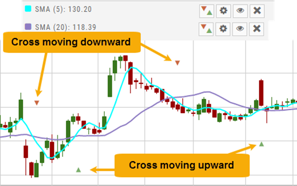
Chart crosshairs
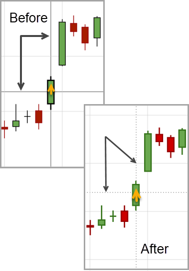
The cursor crosshairs on the chart have been adjusted so they no longer obscure the candlestick wicks
Journal Activity Line
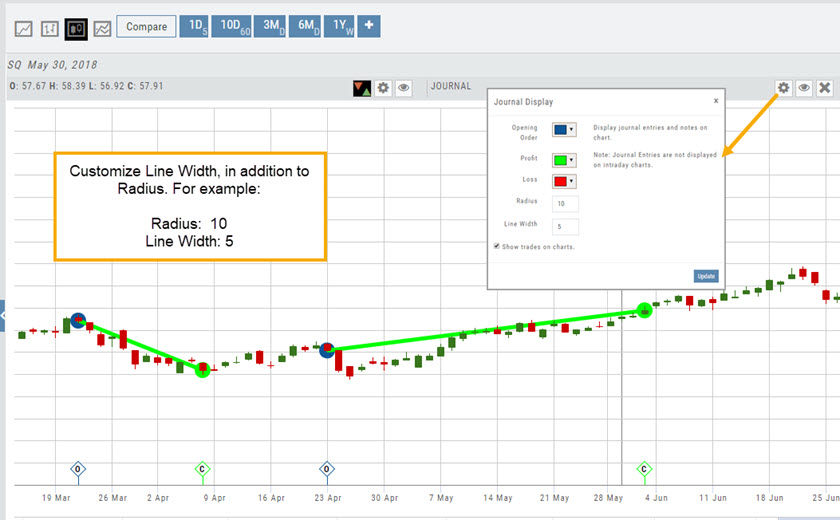
The Journal Activity Line is customizable. Once this indicator is added to your Chart Profile, simply click the Gear icon  to adjust settings:
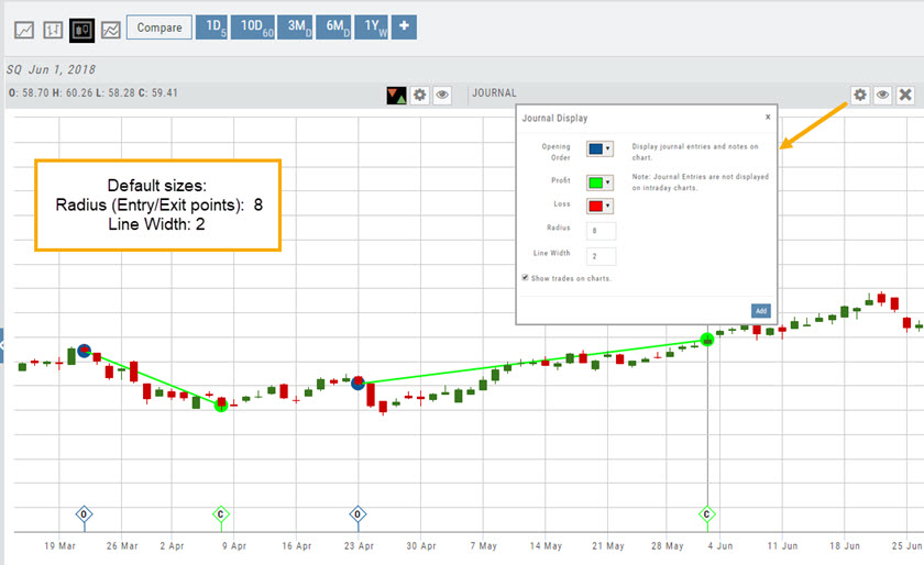
Enter ‘Line Width‘ as well as other adjustments you wish to make on this Indicator , including Open/Close color/size and Profit/Loss line colors.
When completed, click “Add” to close the Journal Display Box and update display.
Drawing on the chart
Trend Lines, Notes & Shapes and Advanced Annotations
Customize your charts with Trend Lines, Notes and Advanced Annotations.
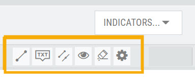
These tool icons are available above the chart, just below the Indicators drop-down box.
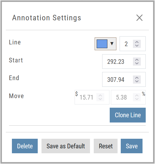
Each Annotation can have a Default Setting. This means all initially created lines, for example, will have the same settings, such as color and thickness.
Select your Annotation.
Draw it on the chart.
Click to display the dialog setting.
Adjust settings, then click “Save as Default.”
“Reset” will revert to initial settings.
You can still customize individual lines by saving the settings instead of saving as Default.
Fibonacci Too!
The Fibonacci Annotation has been enhanced to allow you to select which Retracement Levels you want to view, in addition to adjusting the color for each and the overall transparency.
The settings can be set as the Default for new chart entries or customize each entry, then “Save”.
**Please note: Existing Fibonacci annotations cannot be edited with this new coding. They must be deleted, then added back.
In addition, individual retracements can be extended Right and/or Left. Click the annotation on the chart to open the dialog box.
Note: The Extend Right/Left option cannot be set as a default setting.
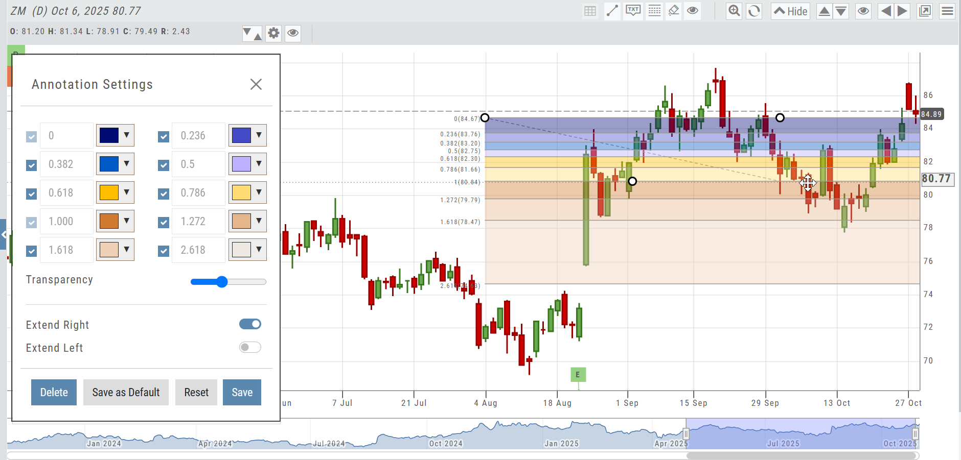
Clicking on any Trend Line, Note, or Advanced Annotation, will display the “Annotation Settings” box for that entry.
The Annotation Settings box can be repositioned elsewhere on the platform, if needed.
Line Color, Line Width and if applicable, Background Color and Transparency can be changed.
Be sure to click ‘Save’!
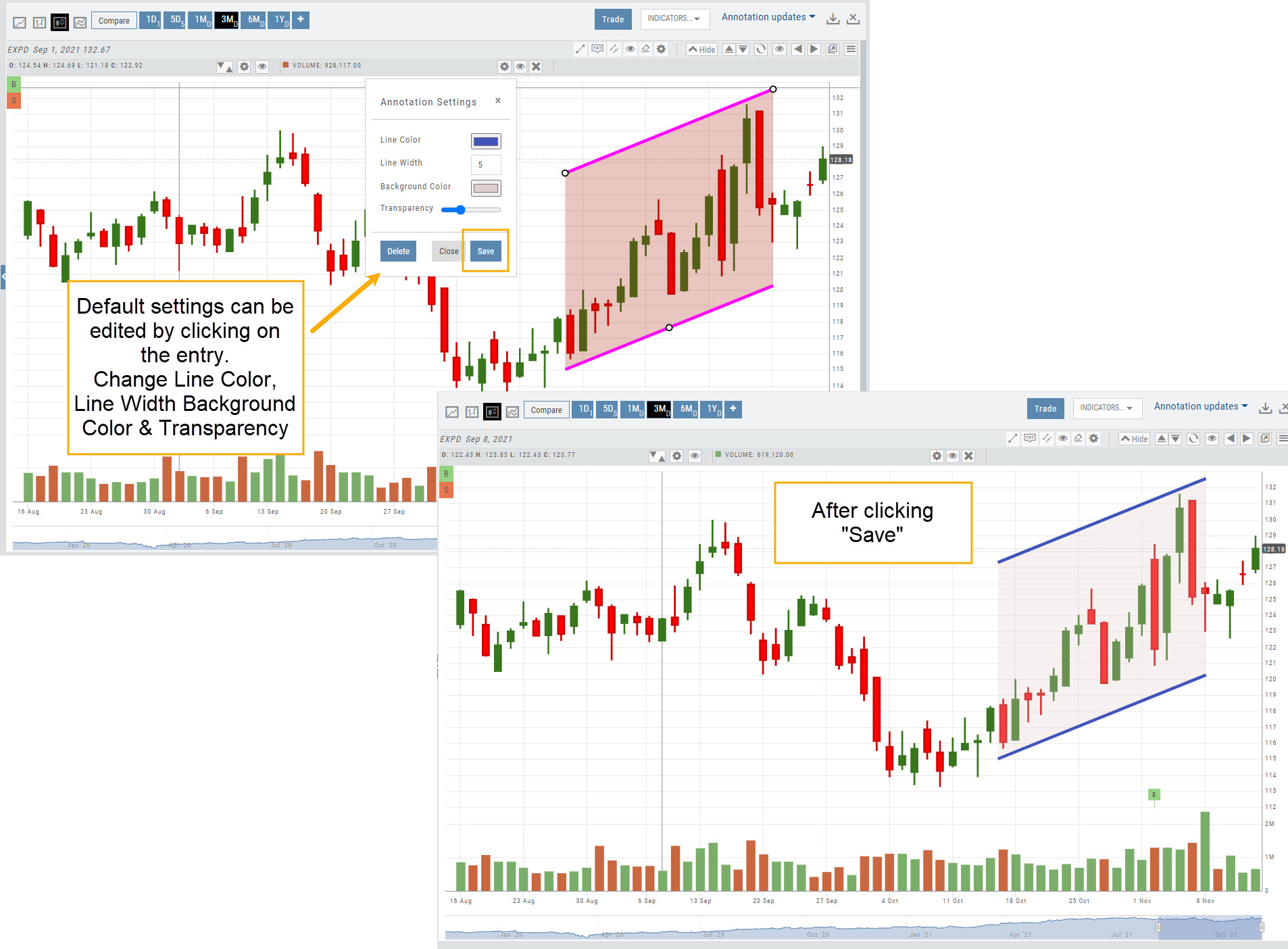
Note: Parallel channels are initially drawn horizontally. To change orientation click on the annotation then grab one of the ‘edit dots’ to drag to the position you wish.
Then click “Save” on the dialog box.
Click on graphic to view examples of editing the color/sizing

Click on graphic to view examples of moving and changing end points of charting annotations.

Extend Fibonacci Retracements on Charts
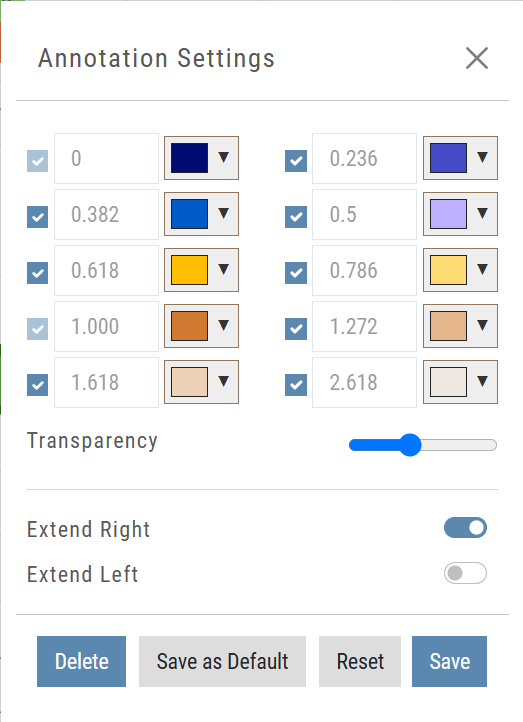
Fibonacci retracements can be extended right and/or left on the chart.
Click an existing Fibonacci annotation, then use the toggle switches to adjust it.
Don’t forget to “Save”
Note: Extend Right/Left can be edited/saved individually, not Set As Default.
Trading from the chart
Trade from the Chart
The chart is also a trading surface: place orders from it, watch working orders on it, and see pre/post-market activity on intraday views.
The  button appears at the top of the chart for any symbol – whether there is an existing position or not.
Clicking this button activates an Order Window on the Chart, like this:
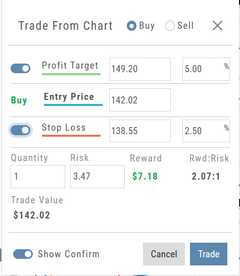
Note: Buy, Profit and Stop Loss line colors will match those displayed on the chart itself.
The values in the Order Window can be manually adjusted by $ or %
The values can also be dynamically adjusted by moving the corresponding line(s) on the Chart itself.
The Quantity value default is “1” to show the ‘per share’ dollar and percentage estimated risk, reward, as well as Position Total.
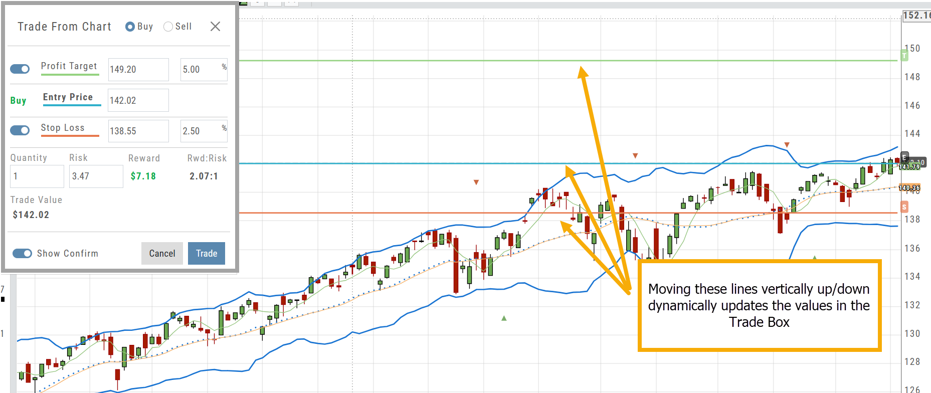
Show Order Status (Go to Order Ticket)
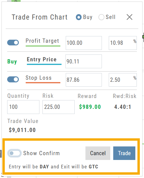
When trading from the Chart (OCO orders), you can elect to Show Confirmation – or not.
Toggling “On” will take you to the Order Ticket to review and submit your Order to the supporting brokerage.
Additional edits and staging the order are enabled with this selection.
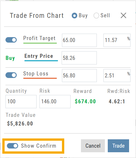
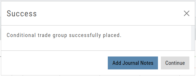
Once reviewed and submitted, you’ll get a confirmation that the order was submitted, as shown here:
Toggling “Show Confirm” to Off, will bypass the Order Ticket window and convert the “Trade from the Charts” action to an Order Ticket itself.
Notice: The Entry is a Day Order, the Exit is a GTC order
Clicking “Submit” will send the order directly to the supporting brokerage.
Since the “Order Ticket” is bypassed, this order cannot be further edited or Staged.
Once submitted, as with “Show Confirm” activated, you’ll see this notice:
Intraday Charts displaying Pre/Post Market Activity
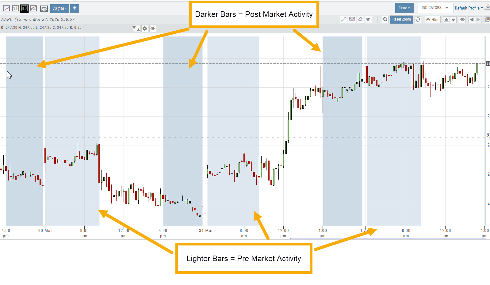
Intraday extended-hours charting enables users to visualize price movement beyond standard market hours, providing a more complete picture of how news, earnings, and overnight activity impact their setups. This helps reinforce timing, entries, and the real-world behavior of the markets.
Extended Trading Hours
Pre and Post-Market activity can be displayed on Intra-Day charts:
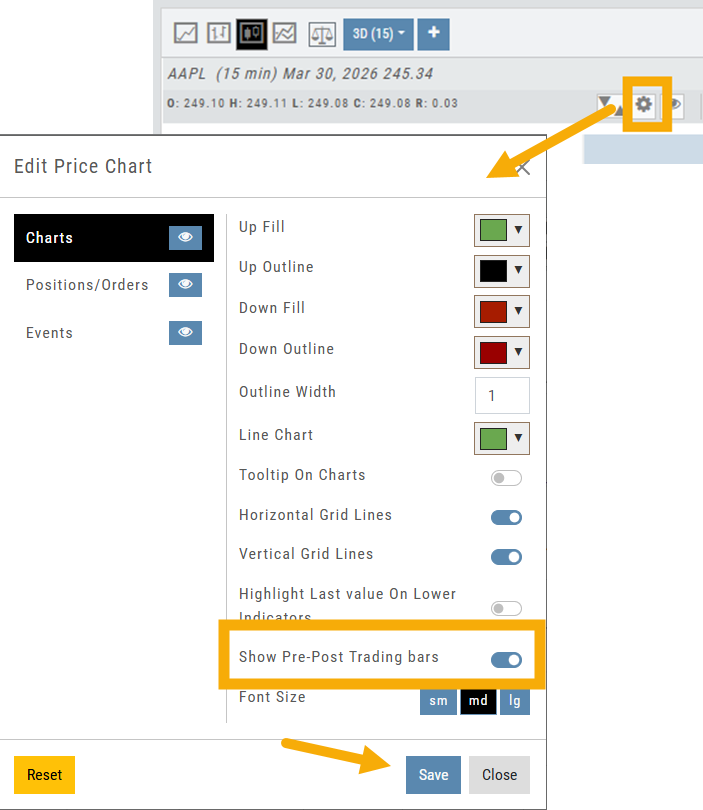
First, click on the Gear icon as shown.
Then, toggle “Show Pre-Post Trading bars” to the On position, as shown.
Finally, “Save”.
Working Orders Displayed on Chart
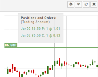
Charts display working orders and existing positions of selected brokerage accounts, currently Choice Trade and TD Ameritrade. More brokerages will be forthcoming.
- Stocks show a horizontal line at the entry price.
- Options show a horizontal line at the strike price.
- Green for Long and Red for Short.
The group of 4 icons, located above the Working Order, allow you to Edit (Gear), Hide(Eye) Refresh (Circle arrows) or Remove (X).
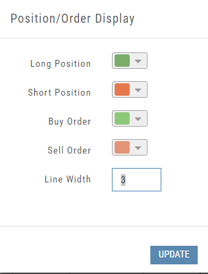
Display choices including colors and line width are available in settings by clicking the “Gear” Icon.
Heat maps and the Spectrum
Heat Map & Spectrum Overview
A color-first way to read the whole market and drill into sectors, industries and stocks — plus the data points, filters and legend that make the maps precise.
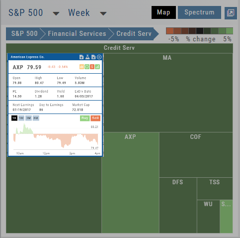
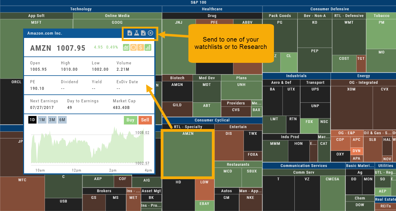
The Heat Maps are accessible in the Market tab and under Find>Explore and provide powerful visual views of market performance. This feature is designed to adapt to a variety of strategies and outlooks according to your portfolio needs. Select Index and Time Frame using the Action Icons. These can be changed going forward in any map screen.
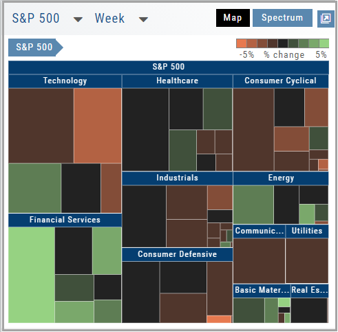
In the Map view, each box represents either an industry group (default) or a stock when you drill down. The size of the box represents the market cap. By hovering your cursor over each box, an info box appears with info on that group within that industry, including the number of companies, Market Cap, % Change in selected time frame.
Heat Map View
Each box in the Map View represents either an industry group or a stock when you drill down. The size of the box represents the market cap.
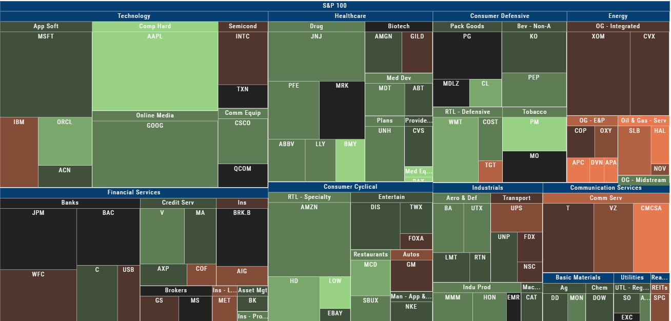
The color represents the data displayed (default : % change) for the time frame selected.
In the Market Tab, select the ‘Go Big’ option in Heat Map for more detail.
You have the capability to adjust your Map based on Stock Price, Average Volume, Market Cap and % Change.
Bonus: The platform will remember your filters until you reset them during the current session.
Spectrum Map View
In the Spectrum view, each column represents the slice of time selected: Day, Week, Month or Trailing Quarter. Once the Time frame is selected, it will be backtracked in each column (Example: April, March, February, January…)
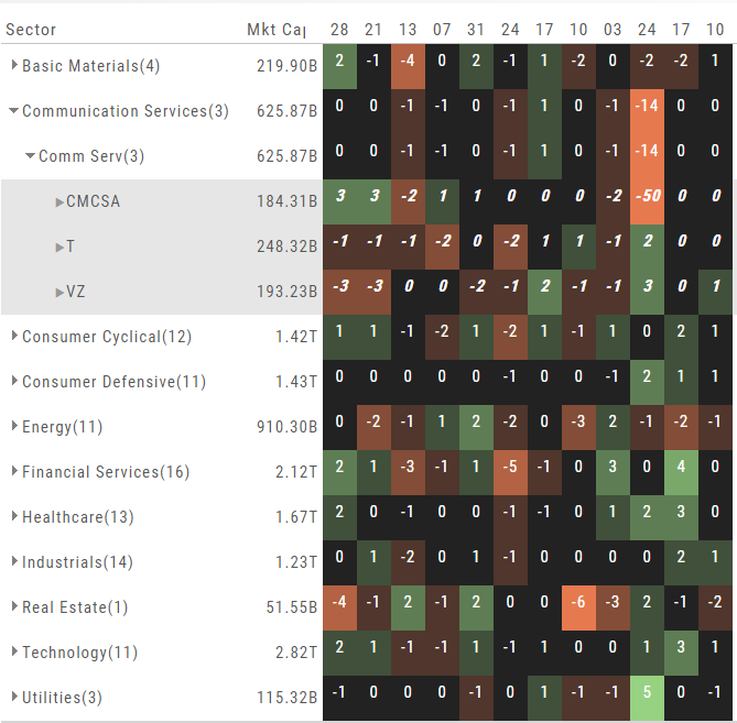
Each row of the selected Index are initially broken down by Sector. By clicking the ‘action icon’, the Industry groups are shown. Clicking on the ‘action icon’ of each Industry will display the Stock symbols within that Industry.
The number and color of each box is a ‘slice’ that represents change (+/- , neutral) for that slice of time for that Sector, Industry or Stock using the Spectrum Color Legend as a reference.
Note the ‘action icon’ next to the Stock Symbol, enabling you to drill down, add to Watchlist, Research, Journal, etc.
Heat Map Data Points
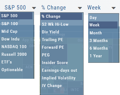
Drop-down menus allow you to select Index, Time Frame and various Data Points. Choose among % Change, Dividend Yield, PEG, 52 week High-Low and more.
Special Maps like Insider Score, Days to Next Earnings, and Implied Volatility are also included.
And of course, by selecting an individual box (stock) for Quote Detail and use the Navigational Icons to Research, add to Watch Lists, Submit a Trade, etc.
Heat Map Filters
Bonus! The Platform remembers your Preferences!
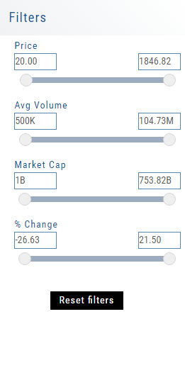
Select the view you like and it will be saved during your current session – even when you navigate elsewhere on the platform. The system will remember the map/spectrum view you set. This includes the type and time period as well.
Streamline your results by using the Filters for Price, Average Volume, Market Cap, and more. The data will be displayed dynamically based on filter changes. You can set your filters and the Platform will remember it until you change or reset it during the current session.
The Legend – Heat and Spectrum Maps
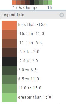
The Legend shows the range of % negative or positive change represented by a color spectrum. It is important to note: the range does adjust according to the data filters you select for the Heat or Spectrum Maps.
Clicking on the legend will show specific range of each color in the spectrum and give additional information about the definition.
52 Week High/Low Value
The 52 Hi/Low Value represents the current percentile of the stock (or sector) relative to its 52 week high/low price range. The Sector Value is the average of stocks within that sector.
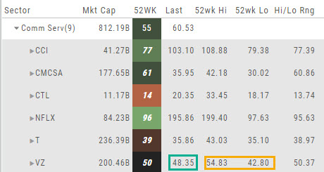
In the Communication Services example, the average for the Sector is 55. When expanded, we see Netflix (NFLX) is near the top of its 52-week range at 96. Centurylink (CTL) is closer to the low end of its range at 14. Verizon’s current price is in the middle of the High-Low range.
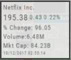
This information is also available on the Map View but hovering your cursor over a stock tile while in the 52 Wk Hi-Low View. Netflix shows the stock is at the 96th percentile of its high-low range.
Remember, you can refer to the Legend (found in the upper right part of the screen) for defined range values for any criteria view you select.
Industry Performance Bar Chart
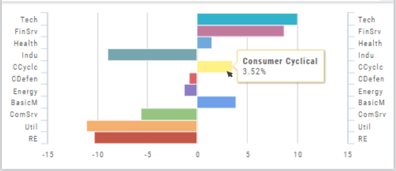
The Bar Chart is located on the Market Tab and updates dynamically with selected Heat Map Index and Time Frame. This provides an additional view of the overall Market by Industry. Below is a 3 month Heat Map/Bar Chart view of the S&P 500. The bottom Bar Chart shows a 6 month view.
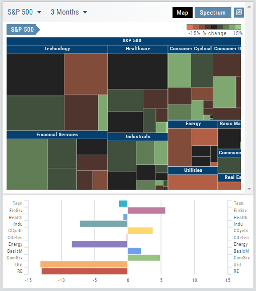
Each Industry is represented by a unique color and are listed by Market Cap – largest on top to the smallest at the bottom. Hover your cursor over each bar for the Industry name and % change of the selected time period to appear.
The center of the Chart is Neutral and will appear blank just prior to the Market’s Opening Bell. Bars extending right of center represents Gains, left of center represents a Loss for the time period selected on the Heat Map.
Explore – Give it a try!
From finding the best stock in the best sector to following where the money is flowing to and from, Heat Maps (and Spectrum, too!) offer insight both interesting and valuable.
Drill down for bullish, bearish and stagnant opportunities.
Heat Maps Too
The Heat Maps on the Market page offer the ability to drill down to the stock level. You are able to do this with both the Map and Spectrum views. Clicking on a stock will also show the quote detail. From this you can also send to a list or research.