
Search for answers or browse our knowledge base.
-
Platform Overview
-
Onboarding Guide
- Articles coming soon
-
Account & Settings
-
Brokers & Accounts
-
Charts & Indicators
- Chart Period Controls
- Extend Fibonacci Retracements on Charts
- Chart crosshairs
- Heat Maps Too
- Working Orders Displayed on Chart
- Chart Types
- Customizing Indicators
- Lower Indicators
- Crossover Arrows
- Chart Navigation
- Adjust Chart Height & Width
- Advanced Indicators
- Adding & Arranging Indicators
- Add/Delete/Save Chart Profiles
- Zoom Feature
- Trade from the Chart
- Chart Adjustment/y-axis
- Intraday Charts displaying Pre/Post Market Activity
- Trend Lines, Notes & Shapes and Advanced Annotations
- Heat Map View
- Heat Map Data Points
- Heat Map Filters
- The Legend - Heat and Spectrum Maps
- Heat Map & Spectrum Overview
- Spectrum Map View
- 52 Week High/Low Value
- Industry Performance Bar Chart
- Explore - Give it a try!
- Journal Activity Line
- Global Chart Settings
- Chart Adjusts for Splits
- 52-Week Hi/Low Indicator
- Show all articles ( 17 ) Collapse Articles
-
Trading & Orders
- I own the stock, how do I enter a Covered Call trade?
- Order Status Filter Buttons
- Bracket Order Adjustment
- Order Types - How to Enter
- The Order Ticket - Stock/ETF
- Conditional Orders (OCO)
- Order Staging (Premium Desktop Feature)
- Access Trading Account Information
- Virtual Account Buying Power Calculations
- Smart Trade Ticket
- Reward/Risk on the Order Ticket
-
Options
- Create Customized Option Table Views
- Option Chain Functionality
- Where are the Greeks?
- Entering a Position
- Trading from Options Page & Strategy Templates
- Trade from the Options Tab
- Trading from the Option Template
- From Strategize to Analyze to Trade
- Strategy Template
- Elements of the Template
- Strategy Snapshot
- Storyboard of the Strategy
- Performance Channels
- Delta & Theta Display on Template
- Profit/Loss Graphs
- Advanced Analytics
- Historic & Implied Volatility
- Options Chain Analysis
- Go Big - Graphs & Charts
- Clickable Legends
- Price Slices - Premium Feature
- Multiple Position Analysis
- Position Indication on the Chain
- Trade Management
- Rolling Positions
- Snapshot: Comparing Positions
- How to use Backtesting
- Start Date
- Analyze Date
- Backtesting Trade Finder scans
- Use SNAP to Backtest Positions
- The Power of Time
- Bid/Ask Spread - Premium Percentage
- Strategy Metrics on the Option Chain
- Show all articles ( 19 ) Collapse Articles
-
Positions & P&L
-
Journal
- Journal Auto-Reconcile
- Journal Tab - Reports
- Color Codes of The Trade Journal
- Life Of Trade Icon/Color Codes
- Link Trades in Journal
- Create Notes to Keep Organized
- Set Up Trade & Journal Sharing (Premium Desktop Feature)
- Journal - Color Tagging
- Journal Tag Analytics
- Symbol Journal
- Journal Navigation
- Updating Journal Entries
- Add New #tags and Auto-Tagging
- Delete Journal Entries
- Backtest from the Journal
- Save Backtested Trades to Manual Account
- Journal Account Multi-Selector
- Tag Results-Table Summary Totals
- P/L & Duration/Timeline Graphs
- Reconcile Trade Notice
- Updating Journal Entries
- Insight Tab in Journal
- Export Reports (Desktop)
- Following a Shared Account (Premium Desktop Feature)
- Life of Trade Journal View
- Journal Tagging - OCO, Trailing Stops, etc.
- AI capability: Journal Analysis
- Refine Journal Entries by 'Status'
- Automatic Account Syncing - Up to 2 Months
- Journal - Trade Results
- Greeks & IV Tab Explanation
- Show all articles ( 16 ) Collapse Articles
-
Watchlists
- Research Watchlist Functionality
- List or Tile View
- Sending from One “List” to Another
- Watch - The Next Step
- Create Watchlists
- Multi-Select Stocks
- Manage/Modify Watchlists
- The Other Lists
- Tile View Sizes
- Customize Watchlist Views
- Create Watchlists from Spectrum View
- Quote Detail without leaving the List
-
Alerts
-
Scanners & Screeners
- Intraday Trade Finder Scan Updates (Premium Desktop Feature)
- Overview of Scans
- Scans - Find Opportunities - Overview
- Scan - Smart search
- The Tile
- Dynamic Scan Information
- Past Scan Results
- Save your Favorite Scans
- The Top 4 Categories
- Filter Scan Icon
- The Dashboard Scan Tab
- Calendars
- Earnings Per Share Performance
- Screener (Premium Desktop Feature)
- AI capability: Financial Coach
- AI capability: Screener
- Show all articles ( 1 ) Collapse Articles
-
Stock Research
- Technical Analysis
- Research
- Overview & News
- Earnings, Dividends and more...
- Price Change Indicator
- Fundamentals
- Fundamentals Tab
- Key Ratio (formerly Valuation)
- Valuation
- Compare Tab
- The Power of "The Score"
- Designed to provide the level of information you want
- Inner Circle - Behind the Scenes
- Inner Circle - Inside Score
- Inner Circle - Institutions
- Inner Circle - Money Flow
- Trade Transaction Types
- AI Analysis
- Show all articles ( 3 ) Collapse Articles
-
Market Intelligence
-
Strategies & Automation
- Articles coming soon
-
Release Notes
- Articles coming soon
-
Billing & Subscriptions
- Articles coming soon
-
Troubleshooting & FAQ
- Articles coming soon
Heat Map & Spectrum Overview
A color-first way to read the whole market and drill into sectors, industries and stocks — plus the data points, filters and legend that make the maps precise.
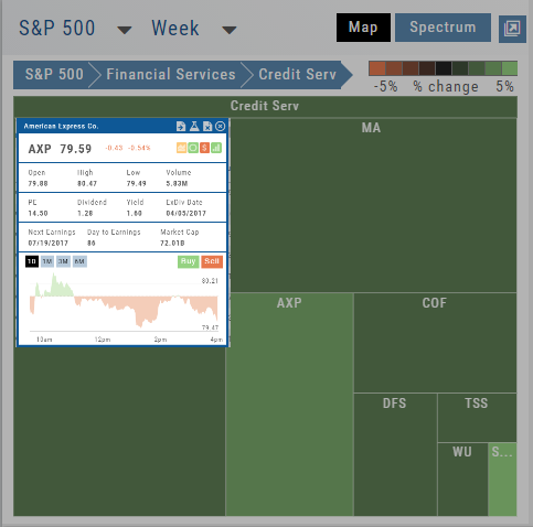
The Heat Maps are accessible in the Market tab and under Find>Explore and provide powerful visual views of market performance. This feature is designed to adapt to a variety of strategies and outlooks according to your portfolio needs. Select Index and Time Frame using the Action Icons. These can be changed going forward in any map screen.
In the Map view, each box represents either an industry group (default) or a stock when you drill down. The size of the box represents the market cap. By hovering your cursor over each box, an info box appears with info on that group within that industry, including the number of companies, Market Cap, % Change in selected time frame.